- The Brand Identity
- Posts
- A rebrand for a storied hotel
A rebrand for a storied hotel
Teel carefully unpacks the history of Sporthotel Lorünser

New project
Teel carefully unpacks the history of Sporthotel Lorünser in its rebrand for the storied hotel
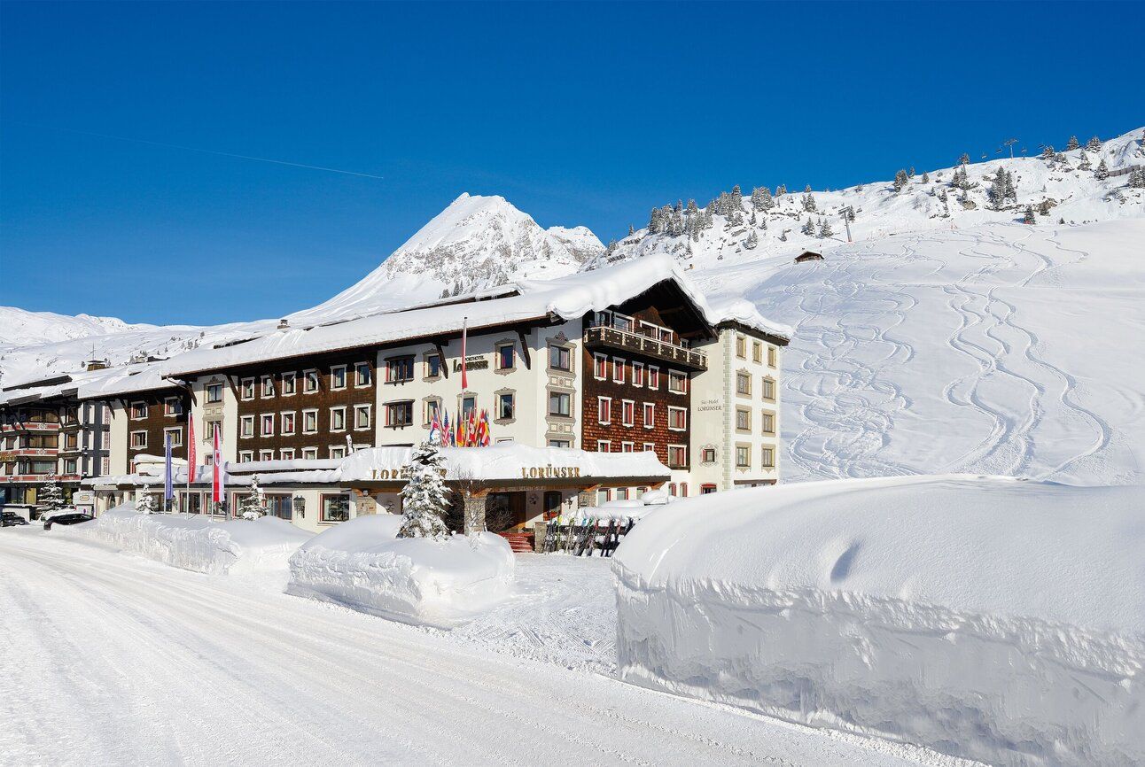
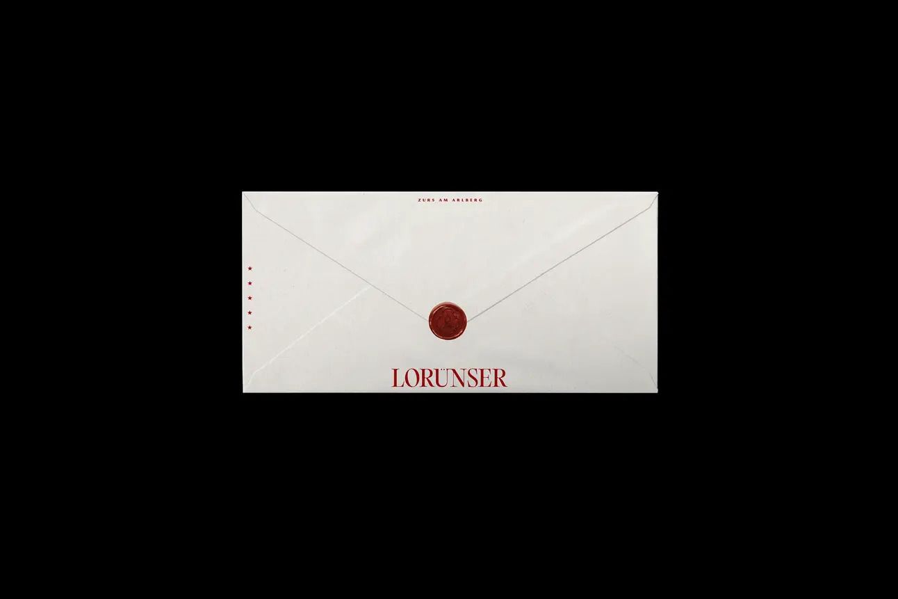
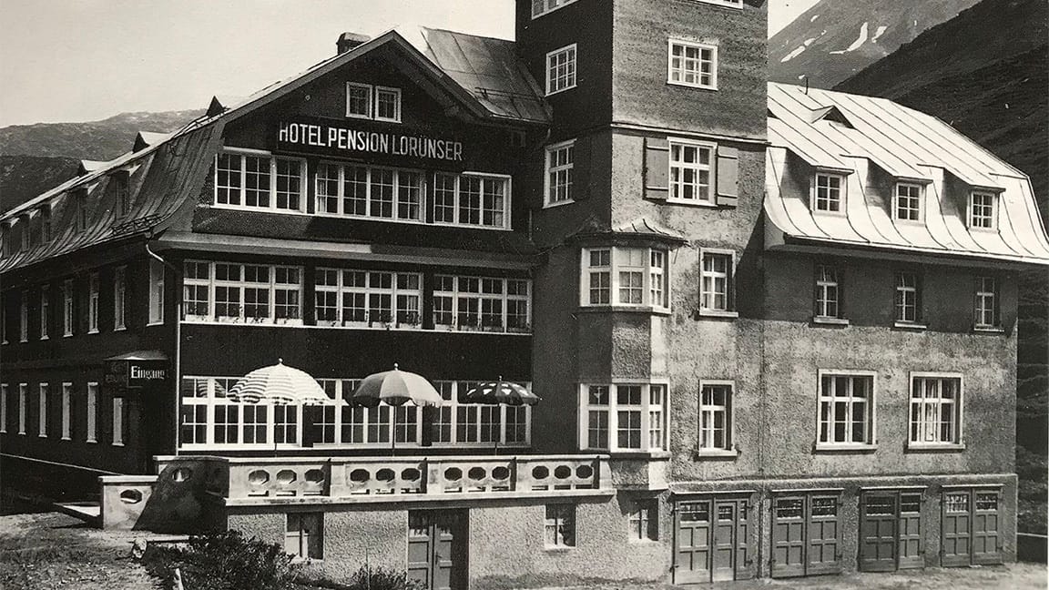
The historic, family-owned luxury hotel, Sporthotel Lorünser, has been sitting in the lap of the Austrian Alps since 1927, when it was established. Through the generations, it has been much loved for its timeless alpine elegance, warm hospitality and ski-in/ski-out access to the sweeping Arlberg slopes. Surrounded by incredible natural beauty, the hotel has evolved through the decades, while always staying rooted in its history. However, Lorünser lacked a clear, cohesive identity and digital presence, and so to establish one, they reached out to Austin-based independent branding and digital studio Teel. The timing was right, too; as they neared their 100th anniversary and completed major room renovations, the moment felt ripe to “elevate the brand across the board,” CEO & Co-founder Cameron Neckar tells us.
“Their existing website was built in-house on Squarespace and lacked cohesion and clarity. Over the years, they had never established a formal brand system or guidelines. The brief was clear: create a timeless, cohesive brand and website that could honour their legacy while confidently ushering in a new era,” notes Cameron. “They wanted something that matched the pride their family holds in the hotel, something built to last.”
When they began shaping the identity, the studio gravitated towards the Swiss chalet style and the vintage Alpine ski hotel aesthetic, while drawing cues from both Lorünser’s storied history and the broader cultural character of the region. And inspiration was rife. Teel, very quickly, began digging into the extensive archive of the hotel, sifting through vintage brochures, historical photography, and other legacy materials, discovering visual gold that would set the tone of the project, and help the design team to understand the hotel’s origins and evolution. At the same time, they looked to the architecture and interiors of the hotel, studying details, art, and furnishings, to ensure that every element of the identity felt considered and cohesive. “As Americans, there was also a cultural learning curve. We took time to immerse ourselves in Austrian culture – its customs, aesthetics, and traditions of hospitality – to ensure the brand felt authentic, respectful, and rooted in its place,” Creative Director & Co-founder Ashton Neckar explains.
As an icon in its own right, it was important that Lorünser’s history was palpable throughout its refreshed brand. So, that legacy became central to Teel’s approach. In many ways, as Ashton and Cameron note, the exercise was less about redefining the hotel, and more about peeling back the layers to unfurl what already existed. “Lorünser isn’t a brand you reinvent, it’s one you reveal. Our goal was to refine what was already there: the quiet elegance, the heritage, the emotional familiarity loyal guests have felt for generations,” says Cameron. “We drew from the hotel’s original materials, tone, and history to craft a brand and digital experience that feels timeless, intentional, and inevitable, as if it’s always looked this way, just waiting to be seen clearly.”
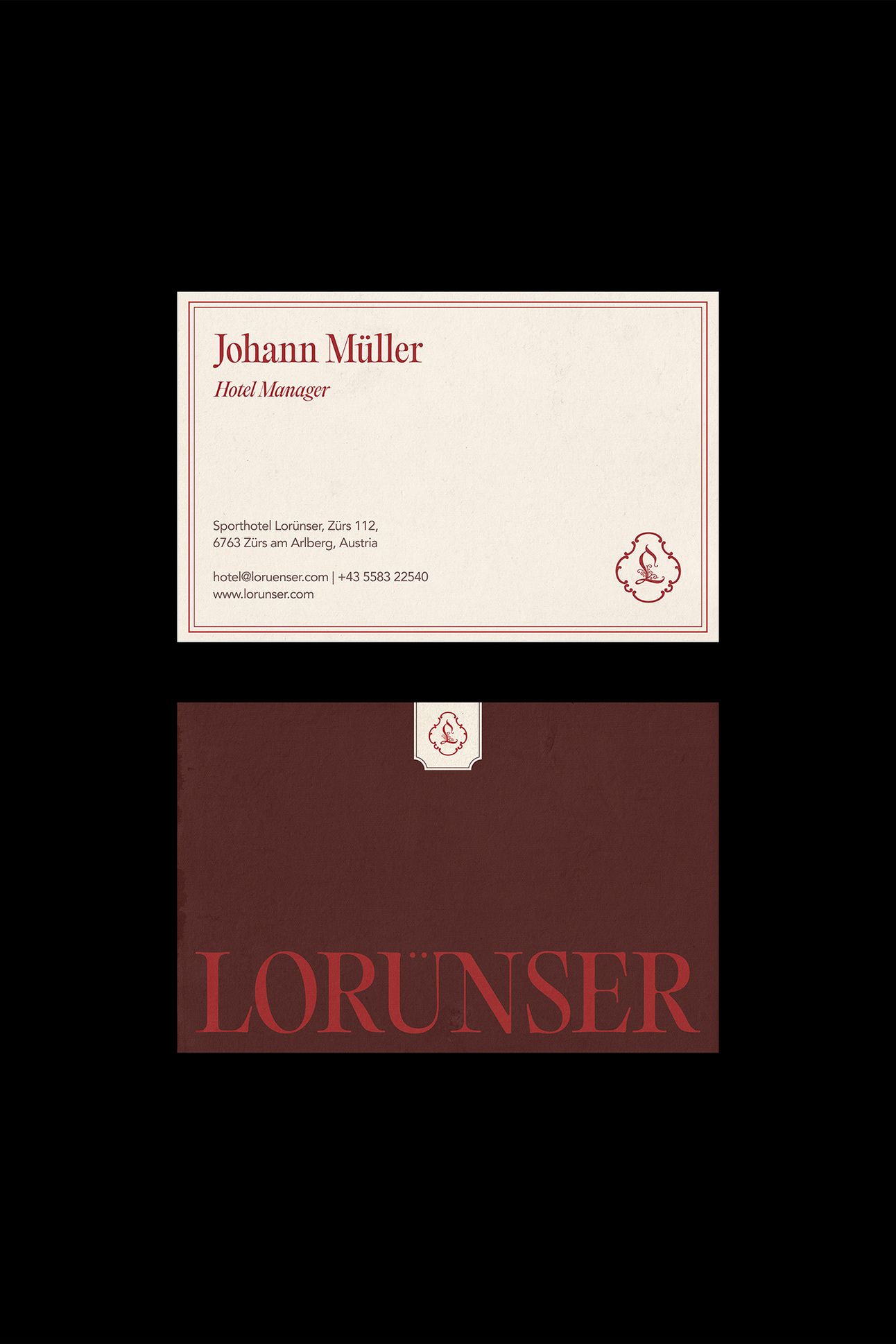
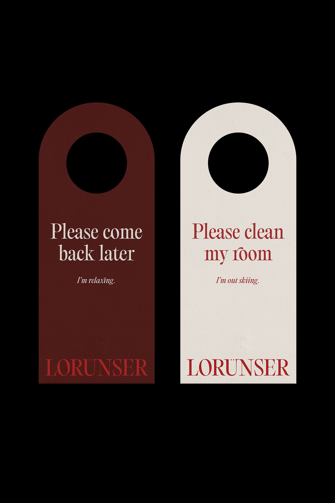
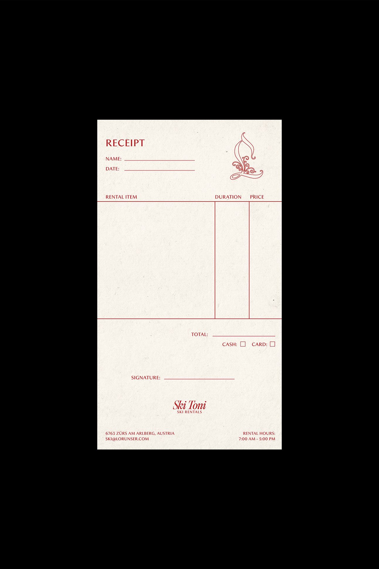
That almost poetic approach touched everything that Teel created. The team’s intention to ground the brand in its time and place is felt in the typographic palette and especially in the wordmark, set in Editorial Old by Pangram Pangram, chosen for its measured balance of classic editorial elegance and subtle modernity. “Its high contrast and sculptural forms echo the refinement of alpine heritage while still feeling sharp and relevant in a digital context. The only customisation we made was to the umlaut above the ‘Ü.’ A small but intentional adjustment to bring harmony and visual balance to the mark,” adds Ashton.
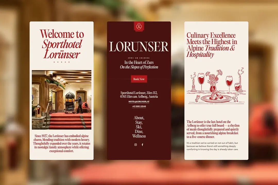
PP Museum is used in navigation items, subtitles and button labels, handpicked because its tone “echoes the style of a vintage travel brochure found in Lorünser’s own archive, making it a fitting nod to the hotel’s historic roots while still feeling fresh and contemporary,” says Ashton. Meanwhile, Avenir, seen in body copy, detailed descriptions and small labels, brings a sense of clarity and balance to the system, a perfect foil to the more expressive display typefaces.
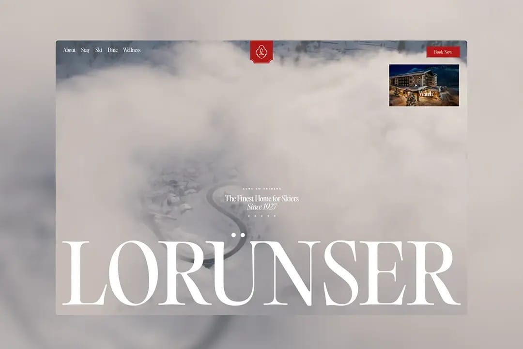
The wordmark and typography truly shine in the website interface, which comes alive with atmospheric, cinemative videos of Lorünser’s home in the Austrian Alps. The soft visuals of the snow-covered valleys, coupled with the striking headlines, create moments of both pause and arresting beauty, encouraging one to dig deeper. “We wanted visitors to feel like they were stepping into the world of Lorünser from the stillness of the alpine surroundings to the warmth of the interiors,” says Cameron. “Every visual was chosen to evoke a feeling, not just to describe the experience, but to let guests feel a taste of it and want more.”
The website, quite fittingly, feels like a true extension of the story Teel tells of Sporthotel Lorünser. “We translated the visual system into an elegant, responsive interface that mirrors the hotel’s personality: timeless, restrained, and deeply intentional,” adds Ashton. “Typography was given room to lead, imagery and video were curated to evoke atmosphere over spectacle, and subtle interactions guide users without distraction. Every design choice, from spacing to motion, was made to feel calm, confident, and rooted in the same values that define Lorünser itself: heritage, precision, and understated luxury.”
