- The Brand Identity
- Posts
- Trawelt takes off in style
Trawelt takes off in style
Holographik delivers a striking identity and web refresh that captures the essence of travel
Elliott Panam-Moody
July 18, 2025
New project
Based on visuals of travel, Holographik’s identity and web refresh for Trawelt take off in style
In contrast to Trawelt’s previous branding and website, which were “put together rather quickly just so they could go live as soon as possible,” Holographik took a more considered approach in its rebrand for the transformation consultancy, tailoring their identity to enhance the web user experience and increase conversion rates. As Design Team Lead Franko Komljenović explains, the look for Trawelt (which specialises in Salesforce solutions for the travel and hospitality industries) also needed to “provide an edge over its competition by visually standing out in the Salesforce network.”

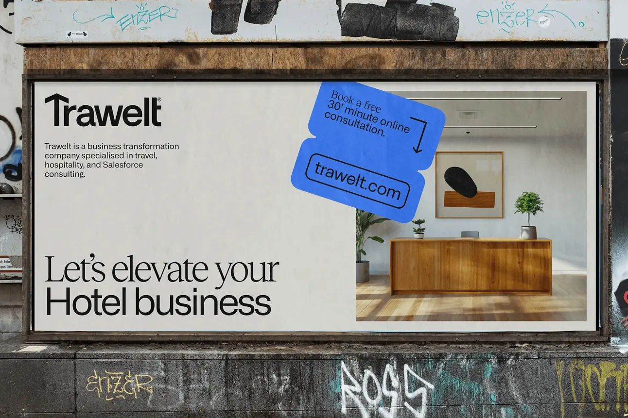
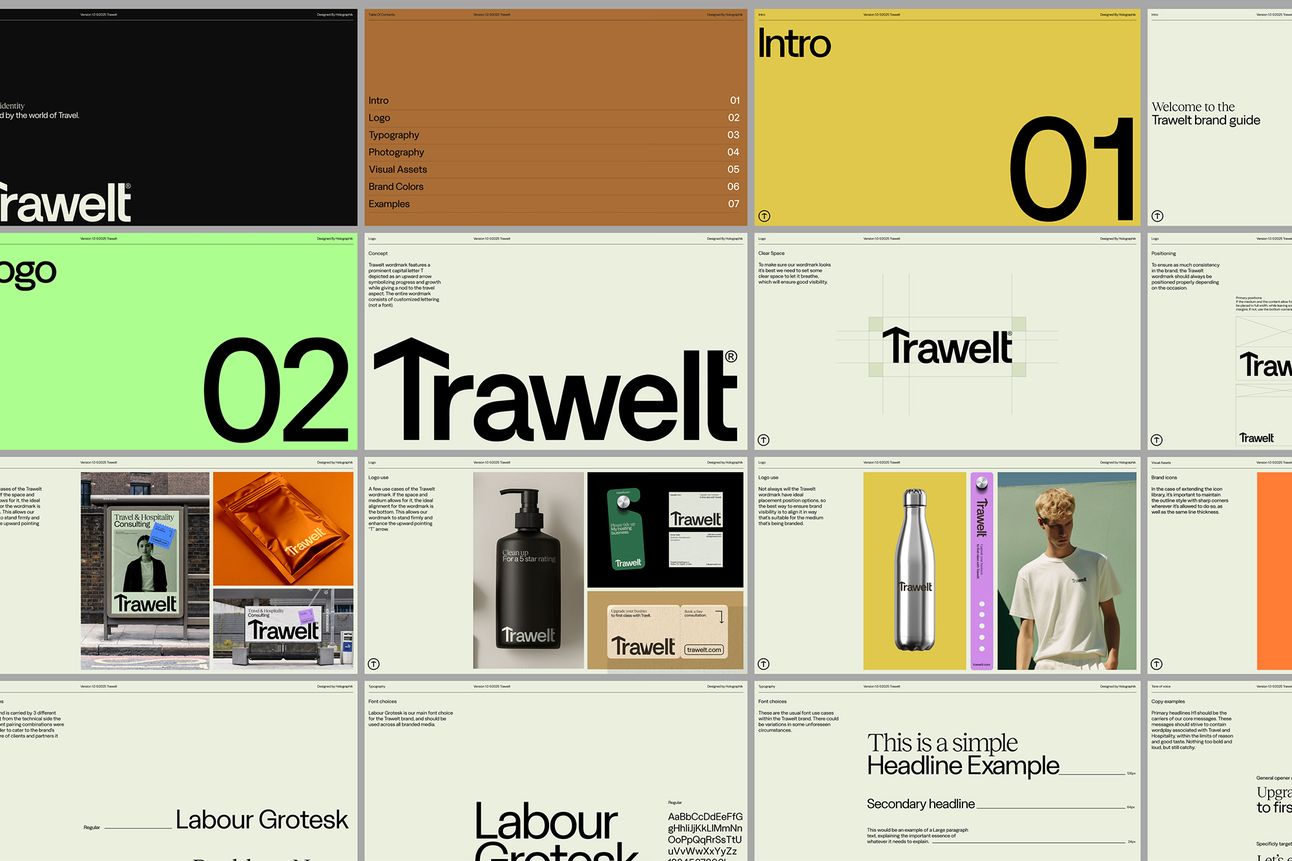
For their identity system, the Zagreb-based creative studio drew inspiration from the visual language and ephemera encountered in everyday travel – the road maps, signs, and tickets that help us on our way. “A key guiding principle in our design process was pathfinding,” Project Coordinator Vito Balen explains, where, just as Trawelt helps businesses navigate toward optimal results, their reimagined identity needed to convey clarity, direction, and trust. “We embraced this philosophy to create a design system that feels intuitive, structured, and inherently connected to the travel experience,” he says.
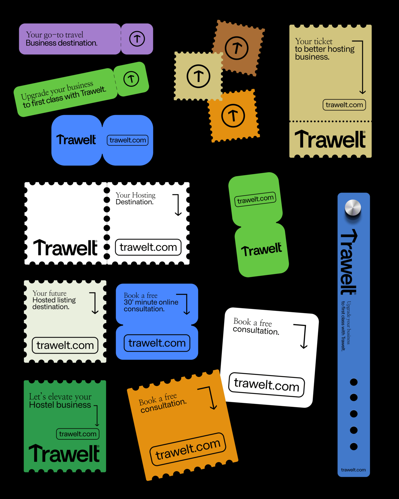
Inspired by the design of road signs and travel tickets – particularly the clear, bold, directional elements that guide travellers – Holographik designed a series of sticker-like graphics used to highlight specific pieces of information. Komljenović adds, “The colour palette was also inspired by road signs, there isn’t a single primary colour but a whole collection. They are strong, eye-catching hues that are used to make elements pop out and attract attention.”
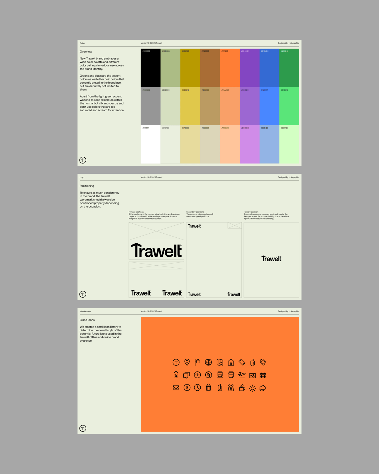
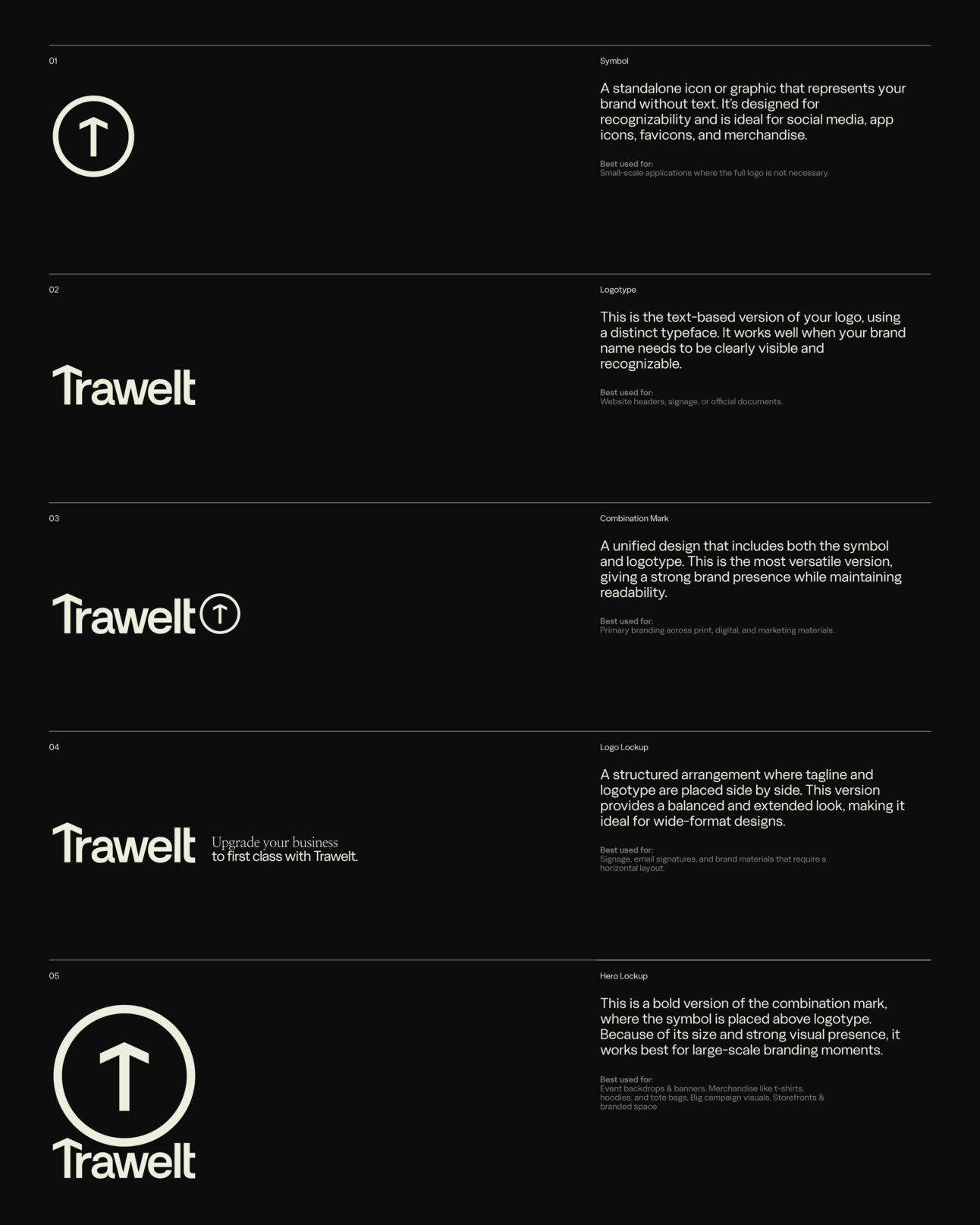
In addition to the suite of signage-inspired imagery, the identity’s key mark – a ‘T’ featuring an upward arrow – serves as a further nod to wayfinding, applied both on its own and alongside the wordmark in various compositions. Complementing the bespoke wordmark (custom-made for ownability), a classic serif and sans serif pairing of Labour Grotesk and Reckless Neue was chosen to “appeal to both small and big vendors,” says Balen.
Showcasing Trawelt’s refreshed look, Komljenović emphasises that the redesigned website prioritises better usability, noting, “We wanted the site to be intuitive and easy to navigate, but also rich with the personality and visual language of the brand.”
This meant using the primary brand colours strategically to highlight key sections, incorporating 3D elements (inspired by the world of hospitality, which includes items commonly found in hotels when travelling) in the hero areas to create visual interest, all while maintaining a clean, structured layout throughout.
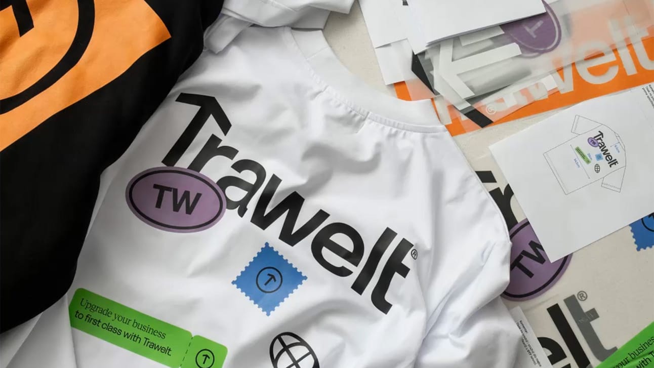
Designed for scalability, the identity lives effortlessly across business cards, CV templates, social media templates, and mockups of various merchandise, among other applications, including merch! “We were glad to collaborate with our sister company Labelworks to produce Trawelt’s merchandise, which brought the brand to life beyond the digital sphere,” reflects Balen. “Overall, this project engaged our entire team, from photography, clothing design, animation, to the creation of 3D assets and digital design. The result is a comprehensive and fully fleshed-out brand experience.”